Nowadays, icon design is in the transitional period. There are many challenges that can lead to some mistakes that designers make. So, every good designer should be aware of these mistakes in order to succeed. So, let’s explore the top 10 mistakes that many designers make in icon design.
1. Icons are not different and separable
![]()
Sometimes, designers fail to differentiate icon designs within the same set of icons, and so it is very difficult to understand what icon has what meaning, especially when they are in the small sizes,
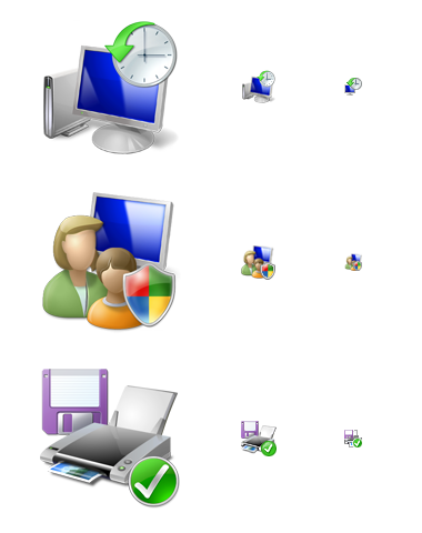
2. Failure to impose icon design uniformity
![]()
The opposite of the last mentioned mistake also exists. Sometimes, designers fail to show that some icons are included in the same set. For example these icons have different outlook, shadows, different style and so on. So, while designing icons of the same set, you should make sure that they look in the same in style but also are easily separable.
3. Not important elements are included

An icon should be easy recognizable and identifiable. So, in order to make it easy to read, designers should make it simple. One of the most common mistakes is to include too many unimportant elements in the icon. Thus, as a designer, you should pay attention to this fact.
4. Unnecessary shadows in small icons

Nowadays, in the design of icons there is a trend to 3D and usage of multiple colors. However, do you think it is useful and effective? I’m not sure about that, especially when we talk about 16×16 or smaller sized icons.
5. Texts are included in the icons
This is usually seen in application icon designs. There are 3 main disadvantages of using text. First of all, the text is in one language, so it is more localized. Secondly, as the icons are small, it is almost impossible to read the text. Thirdly, when you use text in app icons, the name of the application is also displayed, so the text is repeated.
6. Using too many details in the icon
It is sometimes too hard to understand the icon, if there are too many details included in it, especially when this icon is small sized. So, by minimizing the number of details in the icon, it would be more effective.
7. Using boring colors

In order for the icon to be successful, it needs to stand out among many other icons. So, the most important thing that affects the icons’ uniqueness is the color. You should use some strong and attractive colors, in order to make sure that your icon is noticeable.
8. Improper perspective for small icons

When your icons don’t have good perspective and they look ugly in the small size, it means that you have already failed. So, while designing the icons, you must ensure that it looks great both in large and small sizes.
9. Not defining the target audience
![]()
You should always know your audience, according to which you are going to design your icon. For example, there can be some symbols that are not appropriate for some countries. So, you should do some research to identify your audience. Otherwise, your icon can have too much complaints.
10. Always trying to be original
Some designers think that the most successful icons are the ones, which are very original. However, this can end in a very poor design. So, it is sometimes useful to view and research other icons and change, adapt and develop them in your own style.
So, here are the top 10 mistakes designers make while designing icons. Have you noticed any other mistakes designers make in icon design? Share with us in the comments below.
Here’s another article you might like : The Advantages of Icon Fonts

Comments