[vc_row][vc_column width=”1/1″][vc_column_text]Icons express the soul and the image of the apps they represent. For many people, especially iPhone users, iOS icons have always been ideal in the point of design.
In the history of Apple, iOS 7 icons were the first, which were so different from the previous ones. With the arrival of iOS 7, the old icons like drop shadows and heavy textures were replaced with a cleaner and simpler ones. Apple has replaced its old sunflower, bookshelves and other icons with new and fresh ones, like colour wheel, an old-fashioned camera image, covers of magazines for Newsstand and so on. These new iOS icons were so colorful and fresh that some people even criticized them for being very ‘childish’. So, here are some of the design and feature changes that were made in iOS 7.

Weather app
iOS 7’s weather app will no longer fool you to think that it’s always the same degrees Celsius. Instead, it will now provide you with realistic image which will match the current weather and will give you the opportunity to know the weather changes with hour-by-hour breakdown. This change is also reflected in their icon’s design, as instead of the constant sun icon, a new icon shows that the sunny weather won’t be forever and there will be cloudy and rainy weather as well.
Camera app
The camera app’s icon is one of the best ones that almost everyone likes. Now, instead of the camera lens, it represents a silhouette of a retro camera which is more creative. Besides the icon’s change, in the camera app many other features were added; for example you can decide on whether to record video to take a normal, panoramic or square photo and there are many additional filters.
Photos app
After updating the iOS 7, one of the first thing that you’ll notice is the icon of Photos app. Now, instead of the old yellow flower, the icon represents a flower-like colour wheel. As to the changes of its interface, now it orders images in years, months and collections, although sometimes it makes difficult to find the photo you want.
Other apps, which design were mainly changed, include Passbook, FaceTime, Reminders, Newsstand, Games Center and Contacts. In the picture below you can compare the iOS7’s icons to the ones of iOS 6.
Aside for the icons changes described above, Apple has also registered 4 new iOS7 icons as trademarks which are iPhoto, Pages, Numbers, Keynote.
So, since Apple changed so many things in its interface and especially in design, many app developers updated their app icons to more closely align with iOS 7’s new design. The most successful app design changes are presented below.
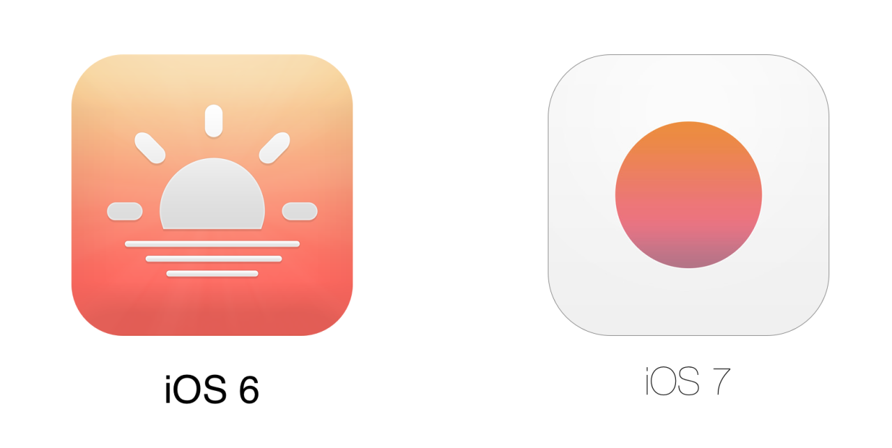
Sunrise
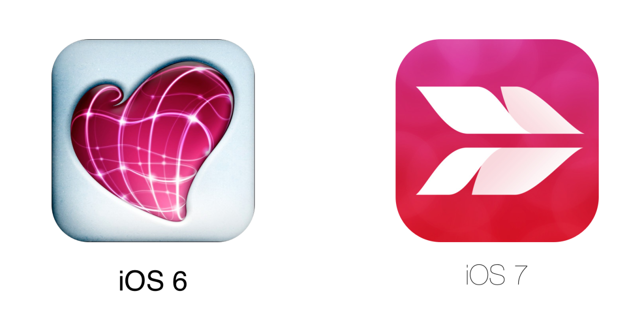
Skitch
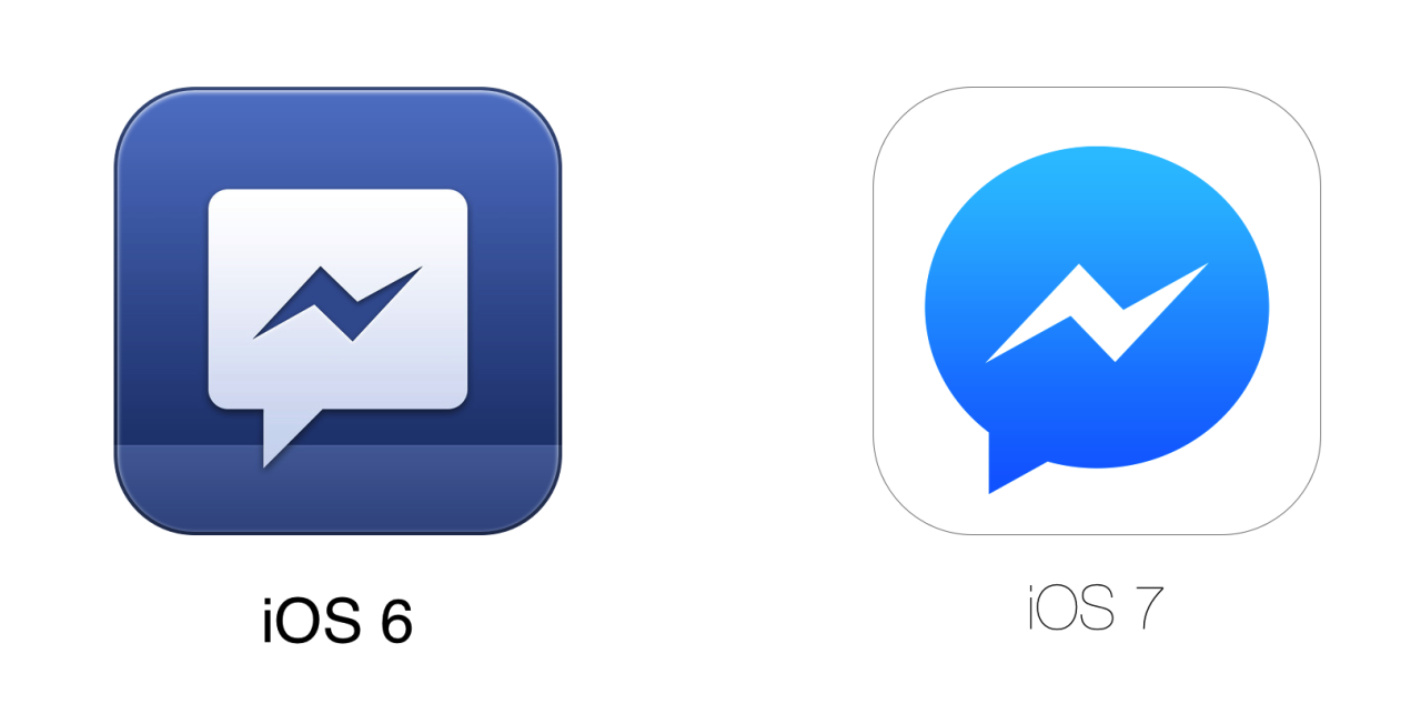
Facebook Messenger
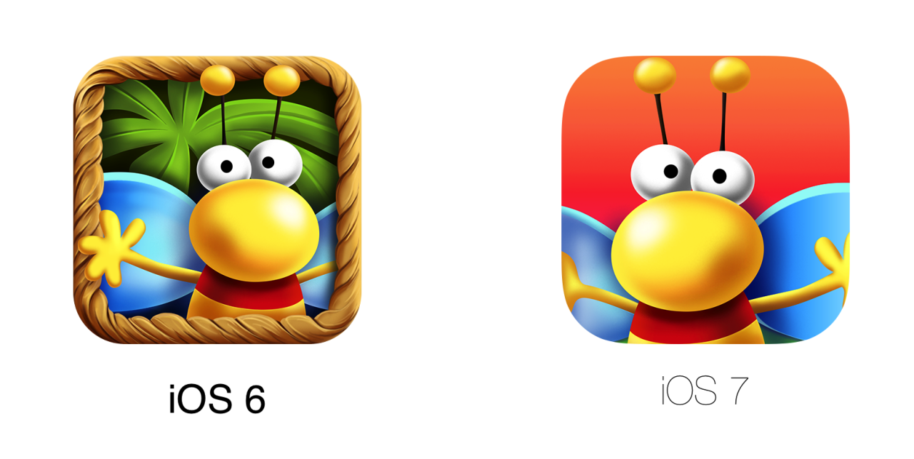
Mordillo find them
So what do you think about these new changes? Do you like them or do you also think that they are too ‘childish’? Share your thoughts with us in the comments below.
[/vc_column_text][/vc_column][/vc_row]
Here’s another article you might like: Apple’s iOS 8.1 is Out Now: Here is The New Features You Need To Know

Comments